Welcome to insights and stories from our wonderful UXPA Community! This new blog series is dedicated to showcasing our members and interesting UX topics. Our goal is to bring together various viewpoints from fellow UXers all over the globe. If you’d like to participate, please email volunteers@uxpa.org.
Designing for Neurodiversity in UX: Embracing Different Ways of Thinking
Imagine if the digital world didn’t look the same for everyone, but worked differently based on how our minds navigate it. For millions of neurodiverse people using technology can feel like solving a puzzle with pieces that don’t quite fit — whether it’s the constant distractions of ADHD, the reading struggles of dyslexia, or the sensory overload often faced by autistic individuals. While traditional approaches to accessibility tend to focus on physical and sensory needs, there’s another crucial aspect we need to talk about: cognitive diversity.
In this series, we’re exploring how UX design can better embrace the different ways people think and experience the online world. We’re not just going to discuss theories; we’ll look at real examples and practical strategies to make digital experiences more inclusive. Our focus will be on three conditions — ADHD, dyslexia, and autism — each with unique challenges and opportunities for more thoughtful design.
Meet Our Characters
To make this more than just abstract ideas, we’ll follow the stories of three individuals: Sarah, who lives with ADHD; Alex, who has dyslexia; and Emma, who is autistic. Their experiences will help us see digital interfaces through their eyes and understand how small changes in design can make a big difference in making the online world feel a little more welcoming.
Designing for Dyslexia in UX - Making the Digital World More Readable
Imagine walking into a library where every book has the same cover, pages are crammed with text, and some of the letters seem to rearrange themselves as you read. For someone with dyslexia, this is often what using apps or websites feels like — words blur together and reading becomes a slow, frustrating process. Designing for dyslexia isn’t just about making things look nice; it’s about creating an experience that feels effortless, where users don’t have to struggle to understand what’s in front of them.
Alex, Sarah’s best friend, is a teacher who loves reading articles online and exploring new apps to help her students. But, she often finds herself squinting at small fonts, trying to decipher cluttered layouts, or second-guessing herself when the text feels overwhelming. Dyslexia is different for everyone, but thoughtful design choices can make a big difference in helping people like Alex feel more confident and at ease in digital spaces.
What Dyslexia Looks Like Online
Dyslexia is all about how the brain processes written language. It has nothing to do with intelligence or effort — it’s just a different way of experiencing text. For Alex, this might mean letters look like they’re swapping places, words blur together, or reading takes more focus and energy than it should.
Picture this: if more websites feel like a straightforward staircase to the average user, for someone like Alex, it’s more like trying to climb a staircase with uneven steps. Dyslexia-friendly design levels those steps, creating a smoother, easier path.


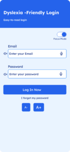
Figure 1. Dyslexia-Friendly Login with the Focus Mode On
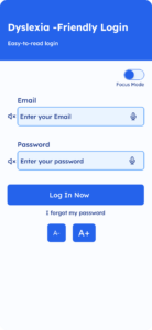
Figure 2. Dyslexia-Friendly Login with the Focus Mode Off
Designing With Dyslexia in Mind
To create digital experiences that work for users like Alex, we need to make the text easier to read, reduce cognitive load, and provide alternative ways to process information. Here’s how we can design a dyslexia-friendly login interface (Figure 3):
- Readable Fonts
Think of traditional fonts as tightly packed letters on a page that can blur together. Using dyslexia-friendly fonts like Open Sans, with clear letterforms and proper spacing, is like laying out words on a well-spaced, clean canvas — making them easier to recognize and process. - Audio Feedback
For users who struggle to process text visually, audio feedback provides a lifeline. Adding a speaker icon next to fields allows users to hear instructions, much like having a guide read the text aloud. It ensures users can understand the task without struggling with written information. - Text Size Adjustment
Imagine trying to read small text when your eyes are already tired — it only adds to the frustration. By including A-/A+ buttons, users can adjust text sizes to their comfort level. It’s like giving them the ability to zoom in on what matters most, providing clarity and control. - Whitespace and Simplified Layouts
A cluttered interface is like walking into a crowded, noisy room — it’s hard to focus. Adding whitespace and keeping layouts clean creates a calm environment where users can focus on one task at a time, making navigation feel effortless and stress-free. - High-Contrast Elements
Low contrast makes it difficult to distinguish text and buttons, especially for dyslexic users. High-contrast colors act like shining a light on important elements, guiding users’ attention and reducing eye strain.
By designing with these principles in mind, we create interfaces that feel welcoming and intuitive for users like Alex. Simple adjustments can make a world of difference, transforming digital experiences into tools of empowerment.

Figure 3. Designing for Dyslexia Using the 5 Steps
It's About More Than Design
What we’re really talking about here is empathy. It’s understanding that for some users, navigating the digital world feels harder than it should. A well-designed login page might seem like a small thing, but for Alex, it means starting her experience on the right foot. It shows her that someone thought about her needs and took the time to make her life a little easier.
Let's Design Together
Have you ever thought about designing for users with dyslexia? If not, try looking at one of your favorite apps through their eyes. How could it be more accessible? Share your ideas, your designs, and your challenges — let’s learn from each other and work together to build digital spaces that work for everyone.
During Week 3, we’ll be exploring autism-friendly design, diving into how predictability and clear instructions can make a world of difference for users on the autism spectrum. Let’s keep the conversation going!
About Brenda
I’m a Product Designer who found my passion for design after earning a Master’s in Business Information Technology from Northumbria University Newcastle. With over 5 years of experience in product and project management, I’ve always been drawn to solving complex problems and creating impactful solutions. That journey led me to UX design where I discovered the perfect balance of strategy, creativity, and empathy.
My work spans industries like fintech and AI-powered property management where I focus on crafting intuitive, human-centered solutions. I’m also exploring how emerging technologies like AI can shape more inclusive and accessible designs.
For me, design is about empathy and curiosity — understanding people and creating experiences that make a difference. Whether it’s rethinking workflows or championing inclusivity, I’m committed to delivering meaningful, human-centered solutions.
Resources
To learn more about Neurodiversity and Dyslexia, here are some helpful resources.
British Dyslexia Association. (2024, November 15). Creating a dyslexia friendly workplace: Dyslexia friendly style guide. British Dyslexia Association. https://www.bdadyslexia.org.uk/advice/employers/creating-a-dyslexia-friendly-workplace/dyslexia-friendly-style-guide
Fessenden, T. (Host). (2024, August 23). UX accessibility and designing for neurodiversity (feat. Stéphanie Walter) (No. 41) [Video podcast episode]. In NN/g UX Podcast. NNgroup. https://www.youtube.com/watch?v=VgwitYuGP7Y
Pun, K. (2016, September 2). Dos and don’ts on designing for accessibility. Gov.UK. https://accessibility.blog.gov.uk/2016/09/02/dos-and-donts-on-designing-for-accessibility/
Sutterlin, K. (2023, September 7). How to design for neurodiversity: Inclusive content and UX [Webinar]. Interaction Design Foundation. https://www.interaction-design.org/master-classes/how-to-design-for-neurodiversity-inclusive-content-and-ux


