
In this article, we discuss results of usability evaluations of desktop and web-based email applications used by those who are blind. Email is an important tool for workplace communication, but computer software and websites can present accessibility and usability barriers to blind users who use screen readers to access computers and websites.
Abstract
In this article, we discuss results of usability evaluations of desktop and web-based email applications used by those who are blind. Email is an important tool for workplace communication, but computer software and websites can present accessibility and usability barriers to blind users who use screen readers to access computers and websites.
To identify usability problems that blind users have with email, 15 blind users tested seven commonly used email applications. Each user tested two applications, so each application was tested by three to five users. From the results, we identify several ways to improve email applications so that blind people can use them more easily. The findings of this study should also assist employers as they make decisions about the types of email applications that they will use within their organizations. This exploratory research can serve as a focus for more extensive studies in the future.
Practitioner’s Take Away
The following are key points from this study:
- Many of the most common desktop and web-based email applications appear to contain some usability problems that impact blind users who are using screen readers and keyboards to navigate them (such as navigation, tab order, contacts, and calendaring).
- Web-based email applications showed poorer performance than desktop applications (this is significant due to the current shift toward web-based applications).
- Many of the discovered problems could be addressed through relatively minor modifications (such as tab order, labeling, terminology, clear confirmations, and the placement of buttons on an interface).
- Applications should be examined closely for their usability when they are navigated with a keyboard alone (because this aspect affects not only blind users but also users with a motor impairment who are unable to use a pointing device).
- It is crucial that all stakeholders involved in developing, implementing, and using these email applications demand universal usability.
Introduction
Email usage is an essential component of communication and collaboration in the workplace (Gruden, 1991; Lewis, Bajwa, & Pervan, 2004). While a significant amount of time that a user spends working with an email application might be spent reading and replying to email messages, features such as email reminders and calendars have also become more important (Kay, 2004). The volume of email that we find in our Inbox on a daily basis continues to increase, while spam and malicious email pose a great challenge (Grimes, Hough, & Signorella, 2007).
Email is one of many desktop applications that have become increasingly portable and web-based. However, web-based applications can introduce many usability problems, and technology like Flash and AJAX can create problems for blind users (Borodin, Bigham, Raman, & Ramakrishnan, 2008). We know that blind users are more likely to avoid something when they know that it will cause them accessibility problems, such as the problems often presented by dynamic web content (Bigham, Cavender, Brudvik, Wobbrock, & Ladner, 2007). We also know that application problems that slow down a work task cause the most frustration for blind users (Lazar, Feng, & Allen, 2006). The 70-75% unemployment rate of individuals who are blind in the US (National Federation of the Blind, 2007a) makes it essential that we identify any email usability problems that could negatively impact blind users in the workplace.
Related Literature
The World Health Organization (WHO) estimates that there are nearly 314 million individuals worldwide who are visually impaired (low vision), and this figure includes 45 million individuals who are completely blind with no residual vision. A screen reader (such as JAWS, System Access, or Window-Eyes) is software that reads the content of a computer screen out loud in computer-synthesized speech, and this is the primary way that blind users access computers and websites. Braille devices are often too expensive, and the rate of Braille literacy among blind users is only 10 to 20% in the United States (National Federation of the Blind, 2007b).
Many email frustrations, such as spam and general email overload, impact both blind and sighted individuals (Williams & Williams, 2006); however, blind users face additional challenges when they use computer software, websites, and mobile devices. Examples of website usability challenges that are faced by blind users are poorly labeled links and forms, missing or confusing alternate text for graphics, and problems with PDF files (Lazar, Allen, Kleinman, & Malarkey, 2007).
In 2008, we conducted a focus group at the National Federation of the Blind in Baltimore, Maryland to discuss email problems that could be negatively impacting blind users (Wentz & Lazar, 2009). These included spam, email search and organization, web-based email navigation, and also problems with calendars, contacts, and visual CAPTCHAs (distorted text used to verify that a user is human and not an automated security threat). In 2009, based on the results of this focus group, we conducted a web-based survey of email usability with 129 blind users (Wentz, Hochheiser, & Lazar, 2010). The results of our web-based survey revealed several important areas of email applications that can be improved for blind users, including web-based interfaces, calendaring, and the email address book. The people who took part in the survey noted concern with search usability, spam, and email attachments. The results of the 2009 survey formed the basis for many of the tasks that we selected for this usability testing.
Research Methodology
The following sections discuss the application selection, the pilot study and modifications, participant selection, and data collection and configuration.
Application Selection
We selected Microsoft Outlook 2007, Outlook Express, and Mozilla Thunderbird/Sunbird as the desktop email applications for this usability study, and Outlook Web Access 2007 Light, Gmail, Yahoo Mail Classic, and Hotmail for the web-based email applications. We chose Microsoft Outlook Express and Outlook 2007 due to the high usage of the Microsoft products during the web-based survey that we conducted in 2009 (Wentz, Hochheiser, & Lazar, 2010). Mozilla Thunderbird/Sunbird was included due to the growing popularity of other Mozilla products. Outlook Web Access was included in this study due to its use in many businesses. Also, when we contacted Microsoft Corporation about the accessibility of its email products, they told us that it was their preferred version for users who are blind, have low vision, or require screen magnification (Microsoft Corporation, 2007). We selected Gmail, Hotmail, and Yahoo Mail Classic due to their high-ranking popularity during our previous web-based survey of blind users (Wentz, Hochheiser, & Lazar, 2010).
Pilot Study and Modifications
Based on the feedback and testing process of two pilot study participants (both of whom were blind), we made some changes to the testing process and questions. For example, a different keyboard was used for the actual testing based on what we were told was a preferred layout of the Home, End, and Delete keys. During a pilot test of Gmail, the ARIA-enhanced version of the Gmail calendar was also tested as a possibility to use for this study, but because no major differences were discovered and because ARIA is not supported by all web browser and screen reader versions, we decided that the standard Gmail calendar would be used. A task to ask the participants to determine the total size of the email account was removed from the task list after the pilot studies, because more than half of the email programs being tested did not have this information available. Our pilot study concluded that there would only be enough time to test two email applications per user, and that the average testing session would take 3-4 hours.
Participant Selection
When we recruited participants for this study, we asked that they be completely blind, screen reader users not able to use screen magnification, and at least 18 years of age. All participants were current email users, and had at some point used email for work-related purposes. We sent recruitment emails to members of both the Maryland and Pennsylvania chapters of the National Federation of the Blind in order to obtain participants, and some members of those chapters also advertised the project to other groups and mailing lists. Fifteen participants were involved in the usability testing (not including the two blind participants in the pilot). In difficult to reach user groups such as those with disabilities, it is considered to be valid to use self-selected sampling methods (Lazar, Feng, & Hochheiser, 2010). Also, because there is no central directory of all blind individuals, a true random sampling would be technically impossible. The goal of this evaluation was to conduct exploratory research with a group of blind users, regardless of their statistical representation of the larger population of blind users.
Data Collection and Configuration
The actual testing was conducted from January through March 2010. The testing was conducted by using an Acer Aspire One netbook (Intel Atom 1.6Ghz processor and 1GB RAM) with the Windows XP operating system and Internet Explorer 8. An external keyboard, external speakers, Verizon Wireless broadband (for testing the web-based applications) and JAWS 10 (screen reader software) were used for the usability testing. Data logging software (REFOG Keylogger) was used to record the keystrokes typed, and a stopwatch was used to record the time spent on each task. We spent time creating test email accounts that could be used for each email application but would also make sure that no personal data of the participants was used. Each email application was pre-loaded with fake email messages, calendar appointments, and contacts (consistent across email applications).
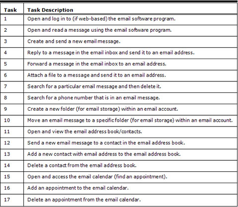
We started each testing session by asking each participant questions about their background and email experience, and then we tested one desktop and one web-based email application with each person. We read each task to the participants, and then they tried to complete each task without our assistance. We used short, descriptive scenarios to accompany each task (such as “You just got back from a lunch break and want to read the most recent email message in your email program”). Each task was timed and recorded for completion, and participants could choose to stop the task at any time. We noted problems and comments when they were mentioned by participants or observed by us. Each application was tested between three to five times. After each application was tested, participants summarized what they liked or disliked about the application. For the actual study, usability testing took an average of 3.3 hours per person. Table 1 lists the usability tasks that were used for all the desktop and web-based email applications.
Table 1. Tasks Used for Email Usability Testing

Results
The following sections discuss demographics, overall trends, desktop (stand-alone) email applications, and web-based email applications.
Demographics
The participants in our study ranged in age from 22 to 60, with the mean age being 37.6, and most of the participants were female (13 out of 15). Fourteen out of 15 participants were college graduates or had completed some college. The average number of years that participants reported using email was 10.7, and the amount of time spent using email weekly was an average of 21.1 hours. Because the unemployment of blind individuals in the United States is between 70-75%, this data is probably not representative of the larger population of blind individuals, but because all the recruited participants were required to have used email for work purposes, this study is probably somewhat representative of blind users who are or were employed. Because the average blind individual might have less experience with email applications than the participants in this study, it is likely that they might have far more difficulty with email applications than the study participants did.
Some of the participants had previous experience with one or more of the email applications that they tested. To account for previous application experience, we calculated the impact previous experience had upon the average completion rate and time spent on successful tasks and included it in Table 2. The exception to this was for Mozilla Thunderbird/Sunbird and Outlook Web Access 2007 Light (because no users had previous experience with those applications). For the most of applications, task completion rate and task completion time both improved when a user had previous experience with an application.
Table 2. Previous Experience and Mean Completion Rate/Time for Successful Tasks

Overall Trends
Table 3 illustrates the percentage of successful task completion for each task in each email application. It is important to note that tasks 16 and 17 (adding and deleting calendar appointments) held the lowest overall performance for task completion. Outlook Express faired the most favorably for task completion, with a mean of 91%. Yahoo Mail ranked the lowest with a mean of 35% for task completion.
Task 12 (sending a new email message to a contact in the email address book) took users the most amount of time with a mean of 281.1 seconds (or 4.7 minutes). Across all tasks, Yahoo Mail Classic once again held the worst time performance with a mean of 231 seconds (or 3.9 minutes). Outlook Express also again displayed the best time performance with a mean of 59.7 seconds (approximately 1 minute) per task.
Outlook Express has no data for tasks 15-17 because it does not include a calendar feature. Also, Gmail and Yahoo Mail Classic have no time data for several tasks, which means that for some tasks, no participants were able to successfully complete them. Web-based email applications had lower rates of successful task completion than desktop email applications, with a mean of 54% task completion compared to 78% for the desktop email applications. The web-based applications also took users much longer to complete a task, with a mean of 173.9 seconds per task compared to 108 seconds per task shown by the desktop email applications.
Table 3. Mean Percentage of Task Completion and Mean/SD (in seconds) for Successful Tasks

Desktop (Stand-Alone) Email Applications
Three desktop email applications (including Outlook 2007, Outlook Express, and Mozilla Thunderbird/Sunbird) were evaluated for their usability. Because 15 users each tested one desktop application, each of these three applications was tested by five users.
Microsoft Outlook Express
Outlook Express appeared to be one of the most usable email applications that we tested. The lack of a calendar feature may have contributed to the high rate of success with Outlook Express, and this might also make it less appropriate for many business environments (as well as the fact that it is not included with the newest operating systems). Some of the few issues that were noted with Outlook Express included the lack of a good search feature, difficulty in finding the address book, a poorly functioning spell check feature, and the lack of a prompt to save something when the Escape key is pressed on a keyboard (a feature that was said to be helpful to blind users).
While the lack of good search, spell check, and save prompt features are things that could negatively affect both blind and sighted users, there are reasons why those features are more important for individuals who are blind. Because a blind user cannot visually scan the inbox or folders for a particular email, he or she is more reliant on search features than sighted users (particularly when managing a large number of emails). While a spell check feature is important to all users, having good spell checking functionality is even more important when you cannot quickly visually scan back through a document for spelling errors, but instead must listen to individual words and possibly letters to verify that the spelling is correct. The save prompt feature is convenient for all users, but it is often very important to blind users because they cannot see when an email or network problem caused a message not to be sent or when some other software malfunction causes the email “compose new message” window to be closed. The address book location is also more difficult for blind users because they rely on the text menus to find it rather than the visual address book button that a sighted user can easily locate.
Microsoft Office Outlook 2007
One of the problems identified in Outlook 2007 by four users was that the new Office ribbon presented some usability problems and difficulty when executing shortcuts from the keyboard. Two users could not find a way to save a contact in the address book. One user could not find a way to access the calendar, another user noted difficulty in identifying which date was currently being viewed on the calendar, and two users accidentally created blank calendar appointments (without knowledge of this) when trying to delete an appointment from the calendar.
For a sighted user, there is an obvious visual way to access the calendar and save contacts in Outlook. This illustrates the problems and frustrations that are experienced by blind users who use this application. Creating a blank calendar appointment is something that could happen to a sighted user, but it is also a problem that would be readily visible. Listening through calendar appointments and coming across blank appointments was confusing to the blind users in this study.
Mozilla Thunderbird/Sunbird
Mozilla had the poorest completion rate and time performance of the three desktop email applications that we tested. Several users noted navigational issues with Mozilla Thunderbird as well as labeling problems for things like the “TO” and “SUBJECT” edit fields. There was no audio label read when the screen reader cursor was focused on those fields. There was a drop-down box next to the “TO” field that three out of five users thought was the “TO” edit field, and this created difficulty when trying to enter a recipient email address. Three users additionally commented on the lack of a delete confirmation, which was noted to be something that blind users rely on.
Sunbird is Mozilla’s recommended desktop calendar application, and it seemed to suffer significantly from usability problems. Three users could not tell what date was being currently displayed on the calendar. Three users also had great problems when they were trying to navigate the dates on the pop-up calendar. When creating or editing a calendar appointment, there were also problems seen when selecting the hours for a particular date (see Figure 1). Two users also discovered that tabbing through the “New Event” dialog box did not take them to the “Save and Close” button. Overall comments on both Mozilla Thunderbird and Sunbird were that these applications were both difficult and frustrating to use.

Figure 1. Selecting hours problem in Mozilla Sunbird: The drop-down menu for selecting hours is unusable when navigated with only a keyboard and screen reader.
The current date being displayed on a calendar is something that is obvious to a sighted user, but for a blind user it can be frustrating to wonder what date an appointment is being created on or being viewed. The drop-down for selecting the hours for a date may be somewhat confusing to a sighted user, but it is even more confusing and unmanageable when it is navigated with a keyboard and screen reader. The fact that tabbing through a new event does not take the user to “Save and Close” is a problem that specifically affects a user who is restricted to using the keyboard and screen reader for navigation.
Web-Based Email Applications
Gmail, Hotmail/Windows Live, Outlook Web Access 2007 Light, and Yahoo Mail Classic were the web-based email applications that we evaluated. Because there were four applications and 15 users who each tested one web-based application, all web-based applications were tested by four users, with the exception of Hotmail, which was tested by three users. Words such as “frustrating,” “cluttered,” and “difficult” were comments from many of the users when using the web-based email applications.
Gmail
Focus of a screen reader refers to the position of the cursor where the screen reader is reading the text on the screen. A common problem that participants experienced with Gmail and other web-based email applications happened when they were using the arrow keys or tabbing through items on a screen, and the focus could be lost to the web browser menus and URL field, which caused confusion for several users.
Difficulty finding the “send” and “delete” links was experienced by two users. The calendar and contacts also created navigational problems for many of the users. Only one user was able to create a calendar appointment, and no users were able to successfully delete a calendar appointment. This was primarily due to the problems they experienced when they tried to navigate (with a keyboard and screen reader) through the application. Using the contacts also presented a problem for most of the users, and no users were able to successfully add a contact. One of the problems that created confusion for participants was the “Add contact” link on the left side of the Gmail interface. This is not really a means of adding a contact to the contacts list but rather a link to send Gmail chat invitations (see Figure 2). Overall, three users noted that the Gmail interface was difficult to navigate. Due to the popularity of the application, many of the users had previous experience with Gmail and noted that the basic HTML version of Gmail is easier to navigate with a screen reader; however, it is missing features that the standard version includes, such as the ability to manage contacts and check spelling (Google, 2010).

Figure 2. “Add contact” confusion in Gmail: A sighted user can visually see that the “Add contact” link is related to the “Chat” feature, but when a blind user is listening to links through a screen reader, it seems to be a method of creating a new contact.
A sighted user restricted to using a keyboard could also lose focus in the web browser menus, but at least it is obvious from a visual perspective what has happened, and the user can navigate forward or backward to refocus the cursor on the target screen area. A sighted user may notice that the problematic “Add contact” link is grouped within the “Chat” area of Gmail, but this is not obvious when listening to the links while using a screen reader. The limitations of the basic HTML version of Gmail would affect any user who chooses to use this version; however, because basic HTML is often more usable for screen reader users, they are essentially forced to choose between usability and less functionality.
Hotmail (Windows Live)
Hotmail (now called Windows Live) repeatedly exhibited the problem of users losing focus in the menus of the web browser. The high number of links on the page that were not directly related to the application navigation took users a long time to navigate through. A significant login problem was noticed by users, in that once a user has logged into Windows Live at least once and later returns to the application, the login area changes to a large, JavaScript sign-in button that becomes particularly inaccessible through screen reader and keyboard navigation (see Figure 3).

Figure 3. Windows Live sign-in button problem: This large JavaScript button would be more accessible to screen readers if it were created with CSS.
The number of links in the Windows Live interface is a problem that would affect any user who is restricted to keyboard navigation of the interface. Because JavaScript navigation can often be inaccessible, the design of this button could simply be changed to CSS creating the same visual effect but also becoming accessible to screen readers.
Outlook Web Access 2007 (Light)
Outlook Web Access 2007 Light demonstrated the highest completion rate and the most favorable completion time of all the web-based email applications that we tested. While many aspects of this application were usable, the contacts and calendar did have some problems. When adding a new contact, users lost focus in the browser menu, because the only “Save and Close” button appears at the beginning of the tab order and at the top of the screen (see Figure 4). Users also had difficulty when navigating the calendar, and they often lost focus in the web browser menus.

Figure 4. “Save and Close” button location problem in OWA 2007 Light: The tab order starts with “First name” and never takes the user back to “Save and Close.” A blind user will not know that this button exists back at the top of the window, because using the tab button never takes the user back to this button.
One other major issue that should be noted is that while the light version of Outlook Web Access 2007 is the recommended accessible version, the actual selection of the light version itself presents a usability problem when using Internet Explorer. The tab order on the login page of Outlook Web Access includes a checkbox that can be selected to use the Outlook Web Access Light, but it is above the username, password, and “Log On” button so that a blind user would not realize that the option to select this was present unless the user moved backwards through the tab order (see Figure 5). The Outlook Web Access interface does not give users the choice of using the standard or light version but rather forces all users to use the light version when used in other browsers other than Internet Explorer, such as Google Chrome, Mozilla Firefox, or Apple’s Safari. Overall, users did note that the Outlook Web Access 2007 Light interface was more usable than many web-based email applications, and Table 3 showed it to be more usable than all but one desktop application (Outlook Express) when comparing the percentage of completed tasks.

Figure 5. Illogical positioning of the light version selection in OWA 2007 Light: The “Use Outlook Web Access Light” checkbox should be before the “Log On” button because otherwise it is only obvious to sighted or experienced users that this option is there.
The problem with the tab order positioning of the “Save and Close” button in the Contacts section is a usability problem that would affect any individual using a keyboard alone for navigation; however, because it is only visually obvious that this button exists, it would be even more unusable for blind individuals. This is similar to the problem with the positioning of the “Use Outlook Web Access Light” checkbox on the login screen for Outlook Web Access.
Yahoo Mail Classic
Yahoo Mail Classic was not only the lowest ranking web-based application, but it was also the lowest ranking email application that we tested during this study. Sixteen out of the 17 tasks had completion rates of 50% or lower, and three tasks were not able to be completed by any of the users. As with other web-based email applications, users lost focus in the web browser menus during many of the attempted tasks. The drop-down menu that appears when “New” is selected to compose a new email message was difficult for some of the users to navigate. A script was used to create new folders, and because web browser security settings may block scripted windows, the warning that the script was blocked was not apparent to users, and this resulted in no user being able to complete the task of creating a new folder.
The contacts and calendar presented usability problems for most users, with the “Add Contact” button not working for one user and others being unable to simply navigate the contacts interface. The calendar was also noted to be difficult to navigate. For Yahoo Mail Classic, in general, users complained about the high volume of advertisement content and that the interface seemed to be cluttered and difficult to navigate. Users who had previous experience with Yahoo Mail noted that the no longer available basic HTML version was easier to navigate but was missing some of the features contained in the standard version. One final problem experienced by two users was the “All-New Mail” link. Our users assumed this link would check for all new email, but in reality this is a link to take the user to a newer interface for Yahoo Mail (refer to Figure 6).

Figure 6. Confusing “All-New Mail” link in Yahoo Mail Classic: When listening to links through a screen reader, it sounds to the user that this is a way to read all the emails that have newly arrived.
The problem of lost focus was discussed earlier as disproportionately affecting blind users, and the drop-down menu for composing a new email is something that is only obvious to a sighted user. The blocked script to create new folders is a problem that would affect any individual whose browser is blocking scripted window. The problems in navigating the contacts in Yahoo Mail Classic were related to confusion when navigating the interface with a keyboard and screen reader. A sighted user restricted to keyboard use might experience navigational problems, but these could most likely be resolved through the benefit of seeing the interface. As such, this is a problem that is more accentuated for blind users. The high amount of advertising would be frustrating to all users; however, non-essential content and links are even more frustrating if you are forced to audibly listen to at least parts of the advertising in order to navigate the interface. A sighted user has the option of quickly visually scanning the interface to locate the areas of relevance. The confusing “All-New Mail” link might be confusing to all users, but when quickly read through a screen reader the confusion is more evident.
Discussion
Basic email application features such as reading and replying to email messages seemed to be moderately usable for most blind users. The usability tasks with the highest rates of completion were reading, replying, and searching for email messages as well as searching for content in email messages.
Greatest Challenges
Email application features such as the ability to create folders, move messages to folders, manage contacts, and use calendaring had the lowest rates of task completion.
Web-based email applications had persistent problems with users losing focus from a particular area of the application itself to the web browser menus. Often this lost focus was the result of users tabbing or moving through the interface with the keyboard searching for links or a way to complete a task. Other times, it was the lack of a logical tab order that resulted in the user losing navigational focus. Many web-based email applications provide a sort of basic or HTML-only interface. While users consistently noted improvement in usability when selecting these basic interface versions, the basic versions seem to offer additional usability at the expense of full functionality.
Calendaring had the lowest mean rate of task completion across email applications, and the noticeable problems with calendaring were related to navigating dates in the calendar when trying to view, create, or delete appointments. The navigation of most email calendar interfaces seems to be reliant on visual navigation of the standard month view of a calendar. Another common complaint about the evaluated calendars was the lack of clarity as to which date was the current focus when viewing and navigating through the calendar.
Implications
Organizations that are selecting email applications for desktop and web-based usage should closely examine the options available and make an informed decision based on application usability for all of their users. With the importance of email communication and scheduling through email calendars, the ability for all employees to easily use an application is highly important. Many organizations are currently choosing to move away from desktop-based office productivity software towards web-based office productivity applications. This may prove to be problematic for their employees who have impairments.
The proposed draft revision of the current Section 508 regulations (of the U.S. Rehabilitation Act), which serve as policy for government agencies, specifies that email and web-based interfaces should conform to WCAG 2.0 policies (U.S. Access Board, 2010). WCAG 2.0 Principle 2 specifies that interfaces must be navigable through a keyboard interface and also that functionality must be reached through a logical focus order (W3C, 2008). It appears that many web-based email applications may violate these basic requirements. Individuals involved in drafting public policy should be aware of these and other problems that may exist in email applications. Organizations who are required to follow such public policies should also take this research into consideration when they select or review their email applications.
Future Research Opportunities
While many of the problems uncovered in this study could affect both blind and sighted users to some extent, navigating with only a keyboard and screen reader causes many of those same problems to become more acute and challenging. A suggestion for future research would be to conduct similar usability testing with a group of sighted users (with similar demographic attributes) to obtain comparison data. It would be useful to know whether the same types of tasks (such as calendaring and contacts) also show poor performance among a similar group of sighted participants. Another comparative study might also be conducted with a group of blind users who have much less email and computer experience than the participants in this study as well as a group of sighted users with less email and computer experience. Ongoing research should be conducted on the accessibility and usability of web-based applications for users with impairments, due to the advantages and growing importance of this kind of technology.
References
- Bigham, J., Cavender, A., Brudvik, J., Wobbrock, J., & Ladner, R. (2007). WebinSitu: A comparative analysis of blind and sighted browsing behavior. Proceedings of ASSETS 2007, 51-58.
- Borodin, Y., Bigham, J., Raman, R., & Ramakrishnan, I. (2008). What’s new?: Making web page updates accessible. Proceedings of ASSETS 2008, 145-152.
- Google (2010). Standard view and basic HTML view. Retrieved April 7, 2010, from http://mail.google.com/support/bin/answer.py?hl=en&answer=15049
- Grimes, G., Hough, M., & Signorella, M. (2007). Email end users and spam: Relations of gender and age group to attitudes and actions. Computers in Human Behavior, 23(1), 318-332.
- Grudin, J. (1991). CSCW. Communications of the ACM, 34(12), 30-34.
- Kay, R. (2004). Collaboration Software. Computerworld, 38(29), 41.
- Lazar J., Allen A., Kleinman J., & Malarkey C. (2007). What frustrates screen reader users on the web: A study of 100 blind users. International Journal of HCI, 22(3): 247–269.
- Lazar, J., Feng, J., & Allen, A. (2006). Determining the impact of computer frustration on the mood of blind users browsing the web. Proceedings of ASSETS 2006, 149-156.
- Lazar J., Feng J., & Hochheiser H. (2010). Research methods in human-computer interaction. Chichester, UK: John Wiley and Sons.
- Lewis, L., Bajwa, D., & Pervan, G. (2004). An empirical assessment of the assimilation patterns and the benefits of collaborative information technologies. The Journal of Computer Information Systems, 44(4), 16-26.
- Microsoft Corporation (2007). Accessibility for people with disabilities. Retrieved April 6, 2010, from http://technet.microsoft.com/en-us/library/bb691037(EXCHG.80).aspx
- National Federation of the Blind (2007). Assuring opportunities: A 21st Century strategy to increase employment of blind Americans. Retrieved April 5, 2010 from http://www.nfb.org/nfb/Randolph-Sheppard_facts.asp?SnID=2
- National Federation of the Blind (2007). Promoting braille: A campaign to increase literacy for blind youth. Retrieved September 26, 2007, from http://www.nfb.org/nfb/Louis_Braille_coin_facts.asp?SnID=1758554996
- U.S. Access Board (2010). Draft Information and Communication Technology (ICT) standards and guidelines. Retrieved April 7, 2010, from http://www.access-board.gov/sec508/refresh/draft-rule.pdf
- WC3 (2008). Web Content Accessibility Guidelines (WCAG) 2.0. Retrieved April 7, 2010, from http://www.w3.org/TR/WCAG/
- Wentz B., & Lazar J. (2009). Email accessibility and social networking. Proceedings of HCII 2009 [on CD-ROM].
- Wentz, B., Hochheiser, H., & Lazar, J. (2010). Email usability for blind users. In P. Langdon, P. Clarkson and P. Robinson (Eds.) Designing Inclusive Interactions (pp. 197-206). London: Springer-Verlag,.
- Williams, T., & Williams, R. (2006). Too much e-mail! Communication World, 23(6), 38-41.
- World Health Organization (2009). Visual impairment and blindness. Retrieved April 5, 2010, from http://www.who.int/mediacentre/factsheets/fs282/en/